
Visitors who are "lost" hit the back button FAST. If they can't find what they're looking for, they don't stick around to "figure it out."
That's why getting your visitors to the right part of your site is key to keeping them on your site longer, thereby increasing your odds of converting them from a looker into a buyer.
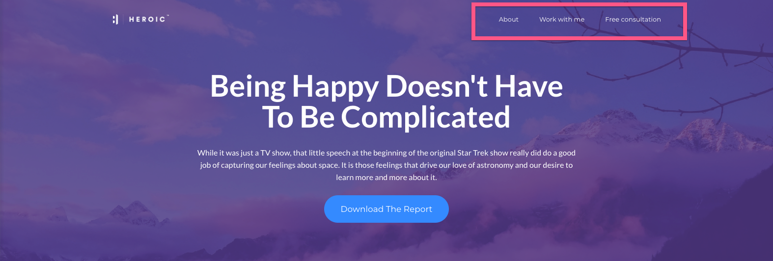
An example of the simplest site navigation are the links you usually find at the top of a website that shows people the different sections of the site that are available to choose from:
You can also have secondary site navigation at the bottom of your pages to reiterate the same page choices or provide alternate choices.
What should you put into your site navigation?
Great question. And the fact is that people get their site navigation all wrong, which leads to missing sales, missing revenue, and lackluster site performance.
In this article, you'll learn how to get the perfect navigation for YOUR website, no matter your business.
While it's true that websites used to have a lot of buttons, more and more sites are streamlining their navigation for two reasons:
- #1 - Streamlined navigation makes your site more mobile friendly
- #2 - Less choice leads to more action.
There was a famous study done by Dr. Sheena Iyengar called "The Jam Experiment."
Researchers were sent down to the local grocery store where they offered jam tastings. Half of the researchers offered 24 choices of jam and the other half offered 6 choices of jam.... And the findings were startling. The shoppers presented with just 6 choices bought 27% more jam.
This is known as "the paradox of choice", which is: the more choices you give buyers, the less you'll sell. After a certain point, they just kind of glaze over like a jelly donut....
That same experiment also revealed that SEVEN was the tipping point for too many choices.
So what this research is telling us is that when you load your navigation with too many options, it can actually WORK AGAINST YOU and distract your visitors from what you most want them to do.
Here's an example of this kind of "all-you-can-eat buffet" approach to navigation:
HOME | ABOUT | BLOG | PROGRAMS | SERVICES | SPEAKING | MEDIA | BOOK | TESTIMONIALS | FREE CONSULTATION | CONTACT
It's like throwing spaghetti against the wall to see what sticks... "Let me just give my visitor every possible choice to see what they respond to..."
But effective conversion is about focus and simplicity. It's the art of guiding attention and inspiring action. And you don't do that by overwhelming people with choice.
So what can we get rid of?
First of all HOME and CONTACT are not necessary in your top navigation.
Most of today's web savvy users know they can click your logo if they want to go home. And even if they don't know, it's really not that important, since the home page is all about directing new visitors where they want to go. Remember, air traffic control strip. And there's no real reason to keep sending them back to the home page once they move on.
While it is important to make it easy for people to get in touch, especially if you have a "call me" business model, you can use a more directed FREE CONSULTATION page to encourage visitors to schedule a call rather than simply contact you.
If it's really important, you can also write out your phone number in the top banner rather than wasting a button on it. Or you can simply feature a contact button in your footer, because if someone really wants to get in touch with you, they will scroll down to the bottom of your site and look for your contact info.
Now let's explore the TESTIMONIALS and MEDIA buttons.
While these sections are important to most business models, I would say they're not essential to include in the top navigation.
Many of the top-converting home page layouts we've created, which I'll share with you in the next video, actually incorporate testimonials and media logos right there on the page. So if you build this kind of credibility and social proof into your pages, it's not as important to break them out in the top navigation. Of course, you can still list these pages in the extended footer of your site, but you don't need to use valuable top navigation real estate for them.
Now let's talk about the SPEAKING and BOOK options.
If you're a professional speaker, then I would recommend keeping a SPEAKING button in your top navigation.
And if you're an author OR one of your primary goals is to sell visitors your BOOK, then I would recommend keeping BOOK in the top nav too. But if you're not primarily a speaker or an author, then these don't necessarily belong in your top navigation. After all, the kind of person who would book you to speak might be different than the kind of person who would buy one of your products or hire you as a coach or consultant.
So that leaves us with just 5 options, right in our sweet spot of 4-6 buttons:
ABOUT | BLOG | PROGRAMS | SERVICES | FREE CONSULTATION
Woohoo! We're making progress....
Next, I wanted to say a word about ordering your navigation before breaking to give you some time to define your top navigation and get our feedback.
So here goes. People read left to right. And they tend to remember most the first and last thing they read. This is called the "primacy" and "recency" effect. This means your first button is the most important, followed by your last button.
So let's start with the all-important first button.
Just like on Google where that #1 position gets 32.5% of all clicks, the same goes for your top navigation.
Let me ask you: How would you like to begin your relationship with your customers? What would *you* like them to do or buy first?
Most people make the mistake of putting the HOME or ABOUT button first. We already talked about the HOME button. So here's the thing with your about page. People are going to click on the ABOUT button regardless of where it is in your navigation. If they want to know more about you, they'll click that button, and the about page usually ranks up there in your top 3-5 pages no matter where you put it. So I usually recommend burying the ABOUT button somewhere in the middle of your nav.
So, now you're probably thinking, what does go first?
I'm glad you asked because as you've probably guess we've done some research on this. We recommend leading with a button that supports your business model and helps convert some of your visitors into subscribers or customers.
So if you have a "Call Me" business model, I recommend putting a FREE CONSULTATION button first. If you have a "list build" or an "Authority" business model, then I recommend putting something like GET STARTED or TRAINING first.
That way you're leading people to a page where they can take a first step with you. Whether that's getting something free -- like an opt-in gift or discovery call -- or even buying something low priced.
Then I would stair-step up into the #2 and #3 spots with higher-level, higher-commitment offerings, before hitting your about page, then landing on that last spot.
For your last spot, I recommend bookending your nav with your BLOG if you have one, since that's where you put all your fresh, agile content. If someone hasn't clicked on one of your offerings, then give them the opportunity to deepen their relationship with you through your blog content.
So your final NAV looks something like this:
FREE CONSULTATION | PROGRAMS | SERVICES | ABOUT | BLOG
As you can see, first up you've got a free consultation -- or training -- or get started button. Whatever that first offering is for you based on your business model.
Then you've got PROGRAMS or some kind of group or levered offering, if you've got one. Then your more high-end, custom, 1:1 or done-for-you offerings such as SERVICES, COACHING, and CONSULTING, if that's part of your business model.
Before ending on ABOUT and finally BLOG.
Now that's much clearer and simpler than our first example, right?
It's night and day different.
By simplifying your navigation to just 5 options, you're really focusing your visitor's attention and increasing the likelihood they click through to another page on your website. And that's key.
Most websites have a 50% plus bounce rate -- which means that more than 50% of their visitors leave the site on the same page they entered without visiting any additional pages. So getting them to stay and click is HUGE.
Here's a sneak peek of the nav I'm using on my new website ... I'm going to have just 4 navigation options: Programs, Work With Us, About, and Blog. That's it.

The other cool thing about reducing your choices is that it gives you a lot more design options.
My favorite navigation style and one that we use for a lot of client sites is what we call the "slim line" nav.
This one reduces the size of your visual branding and navigation so visitors can focus more on the page content, which is where your most important conversions happen.
It used to be that web navigation was really large -- it took up a huge part of the screen -- because visitors weren't familiar with the whole concept of navigation.
Now people get it and that oversized navigation is no longer necessary.
You can still use bigger "traditional navigation" if you like or if you have an older audience, but on today's web you have options...
Before we end this article, I wanted to say a quick word about naming your top navigation buttons.
Because these buttons serve a different function than your call to action buttons which we talked about in the last session.
If you look back at our final streamlined and reorganized navigation, you'll notice that all these button have clear, short and simple titles.
One common mistake I see is trying to get too cute or too clever or too detailed in your navigation. The whole point of navigation is to make it crystal clear what the section is about so people can find what they're looking for.
People get confused and annoyed if they have to click around your website to find what they're looking for or if they go to a page and it's not what they expect.
Here's the thing: if your visitors don't know where they are, where they're going, and what to do next, they're more likely to leave your site without taking any action at all!
I also recommend avoiding sections with similar names -- such as products and programs -- that might confuse people. Or breaking down your content into too many sections or sub-pages, so people have trouble identifying where to go next.
Take 5 minutes now to quickly choose and organize your top navigation, including the names or language for each button. If you already have a website, focus on streamlining and reorganizing your nav.
Remember I recommend keeping your top nav to 4-6 buttons.