
A real question from a Heroic user:
So I'm working with this right now, and finding that it's not super obvious how I might get more exact placement with elements like text boxes and images. Is there a way to make the snapping less prescribed or to give more grid options for where something can be placed?
This is a great question, and it all comes down to how well you want your site to display on mobile screens and tablets. The short answer is that Heroic uses a framework that may not give you the exact placement that you want, but for good reason.
The longer explanation...
We use Bootstrap, the world's most popular web building framework. Its popularity is based in part on being designed from the ground up to look great on any size screen, with very little extra work required from you.
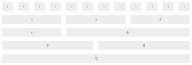
Think of the Bootstrap gird like a 12-column framework onto which you lay your content -- your headlines, text and images.
- Your columns can be any width, from 1 to 12 columns wide
- You can have any combination of columns in a section, up to 12 column widths
- You can have as many of these column layouts as you want in your site
Here's just six of the literally millions of possible column combinations that you can have within any section of your page:
The one downside of having a prescribed column layout like this is that it might not be as flexible as you want.
For example, you can't easily place an image *exactly* 12 pixels from the top and 20 from the right, or have a middle column 25 px wider than the others.
However, the advantages in being a little more rigid with the layout are huge.
Mostly it's that your page will work beautifully in responsive mode -- in other words, on smaller screens.
How? Well, content placed into a column layout knows exactly how to break down and re-order itself as the screen gets smaller and narrower, which is essential when you consider that more than half of the people who view your site will do so from a cellphone or tablet.
The fact is that other solutions that allow you to drag things *exactly* where you want them end up looking incredibly messy when you view them on smaller screens, because the content doesn't quite know how to display itself as the screen gets narrower.
It's funny how sometimes things that start off feeling like constraints can end up giving you greater freedom in the end. :)